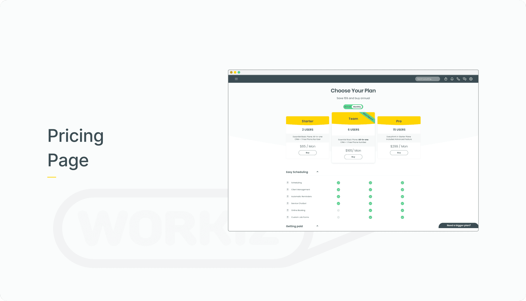
Money Transfer
In this project, I showcase the redesign of the money transfer workflow on Bank Hapoalim’s mobile website.
Team
PM, Head of UI, Myself
My Role
UI and Style-guide, Prototype
Methodes
Conversion rate, Usability, Consistency and ease of use

Background
Bank Hapolaim is a big bank, located in Israel.
It’s the biggest on Israel, and serve 2.2 million costumers.
The Challenge
Research revealed that most incoming support calls—where the average wait time was 5 minutes—were related to payment transfers.
KPI’s and Goal
Reduce the support calls incoming call related to the issue
Enhance the mobile experience, streamline the transfer process.
Increase Customer Satisfaction and NPS Rate


Heuristic evaluating
As part of the process, I conducted a full-story observation to understand user pain points, uncovering key insights. A heuristic evaluation helped identify UX and UI issues in the current design, guiding necessary improvements.
UX Issues
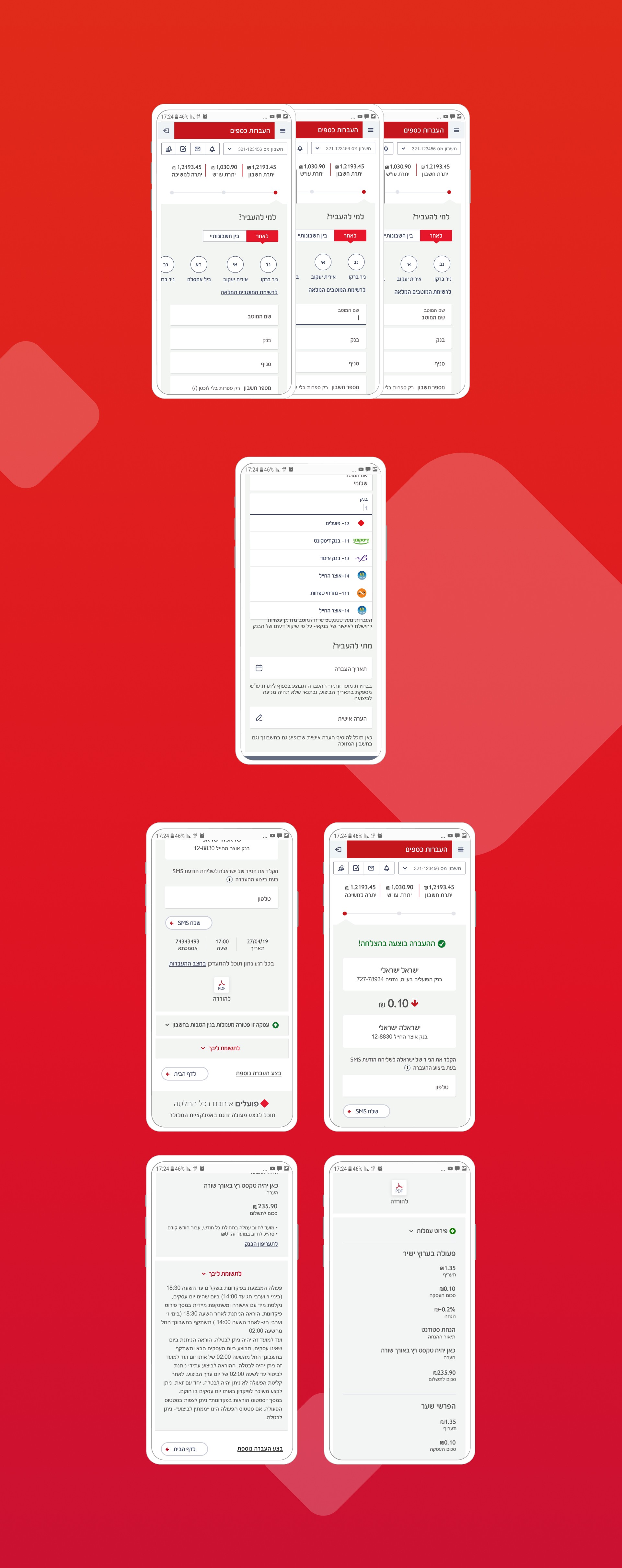
First Screen
Text Alignments issues (#Ecstatic)
Redundant space, lack of consistency
The Buttons are divided (#Usability)
Text field and label aren’t pixel perfect (#Ecstatic)
Tap area is too small (#Usability)
UX Issues
First Screen
Number-keyboard is not displayed after the user taps “amount” (#Usability)
“Next” CTA Button is too small (#Usability)
UX Issues
Second Screen
CTA appears below the fold; the Tap area is tiny
The footer is redundant
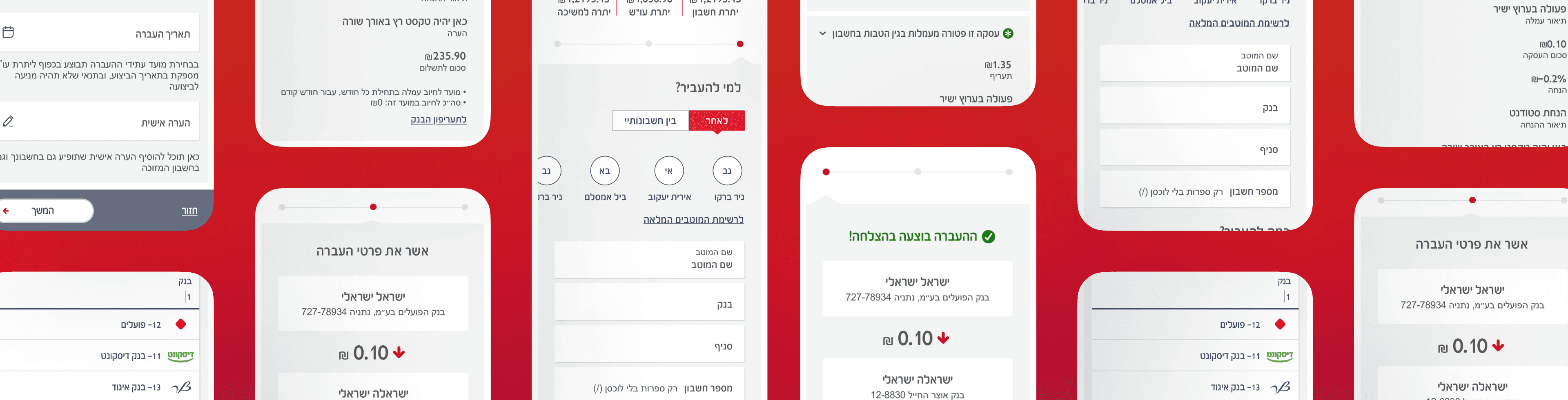
UX Issues
Second screen
Dragging tables horizontally is not intuitive (#Usability)
Collapse Tap area is too small (#Usability)
Two secondary CTA (#Usability)
UX Issues
Last screen
PDF Icon is too small (#Adoption rate)
PDF button Doesn’t seems clickable

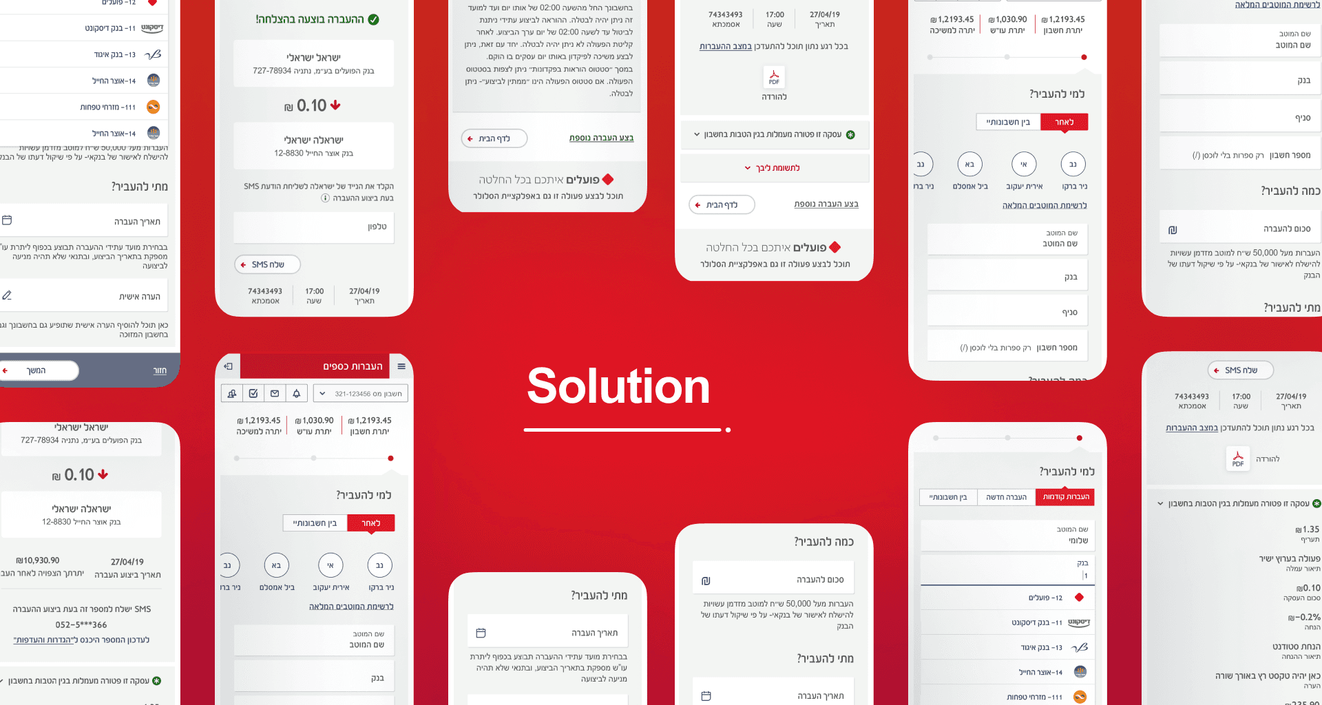
Solution
UX Issues
Step #1
Choosing the last contacts as suggestion
Using a simple and clear text fields, using a label to a “cilli user”
UX Issues
First Screen
Define a bigger the tap area in buttons and text fields
Feedback over interaction/ gestuer
by using states (Normal, Pressed, Full)
UX Issues
First Screen
Improve bank’s logos appearance
Increase tap area
UX Issues
Second screen
Remove redundant Information
Replace Table component with cards
Using in secondary CTA and a link
in order to create a hierarchy Table component with cards
UX Issues
Last screen
Minimize scroll by using collapse component
Emphasize PDF icon to increase adoption