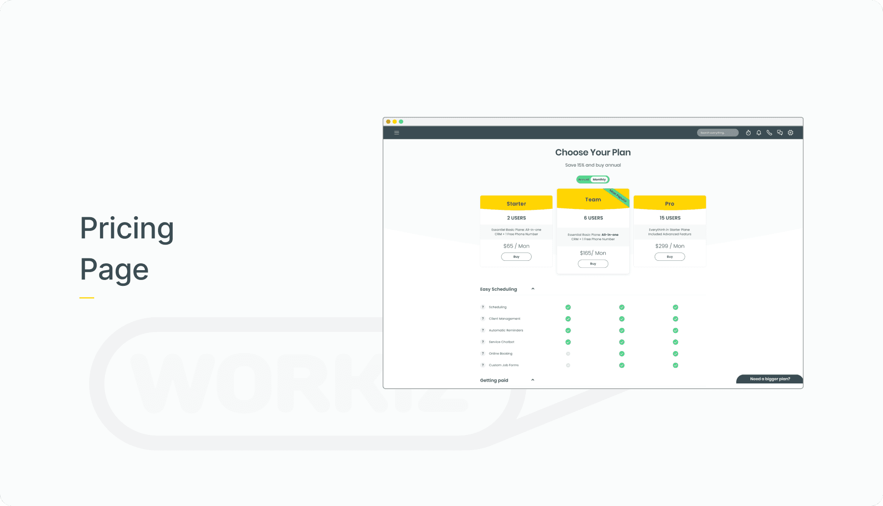
Pricing Page

Discover how I helped Workiz improve Pricing's Usability and Conversion Rate

Team

Product Manager, Frontend Dev, QA

My Role

Observation, Research, Ideate, Sketch, Wireframes, UI-guidelines, Prototype, UI Styleguide

Methodes

Formative Research Market Research Heuristic evaluation Design Thinking Quarries Observations Stockholders Meetings

Background

'Workiz’ is a B2B2C that serves small and medium businesses working in the home service field. Using VOIP technology, Workiz also provides call-center, IVR, and call-tracking capabilities for business owners.

The Challenge

The pricing page had been experiencing a notably low user engagement rate.

Team’s Objective

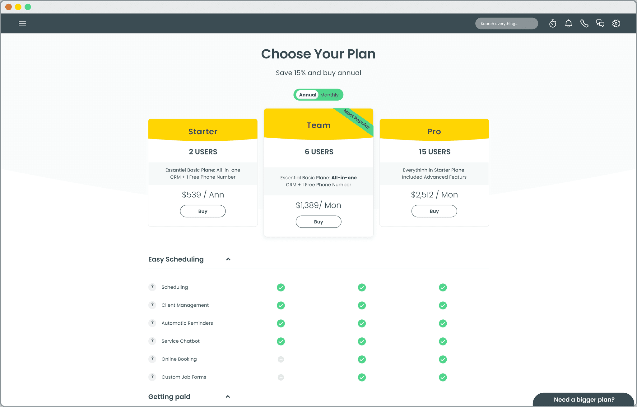
Our primary aim was to facilitate user understanding and comparison of different pricing plans within a matter of seconds.

My Role

Research, Sketch, Wireframes, Prototype

UI Guidelines

Discover

Research Questions

As part of my research I asked some questions. Those were part of them:


  • Which pricing package was most popular according to the sales team, and why?

  • What types of features were considered most valuable across various industries?

  • What user experience patterns did customers commonly use when searching for specific features?


  • Which pricing package was most popular according to the sales team, and why?

  • What types of features were considered most valuable across various industries?

  • What user experience patterns did customers commonly use when searching for specific features?


  • Which pricing package was most popular according to the sales team, and why?

  • What types of features were considered most valuable across various industries?

  • What user experience patterns did customers commonly use when searching for specific features?

Meeting Notes: Insights

Key insights emerged from our research, revealing that various parameters significantly influenced add-on purchases:

  • Varied Verticals required distinct functionality.

  • Different business sizes led to unique requirements.

  • Diverse workflows influenced feature preferences.

  • Varied roles within organizations played a role in feature selection.

  • Integration possibilities factored into decision-making.

Information Architecture

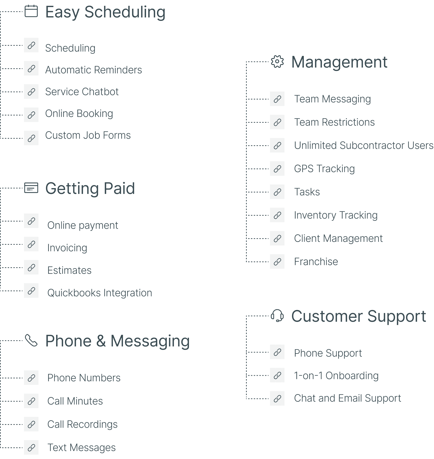
To structure our pricing plans effectively, we adhered to the 80/20 principle and considered insights from customer success discussions. Initially, I grouped similar features and capabilities into relevant categories.
Huerstic evaluatin
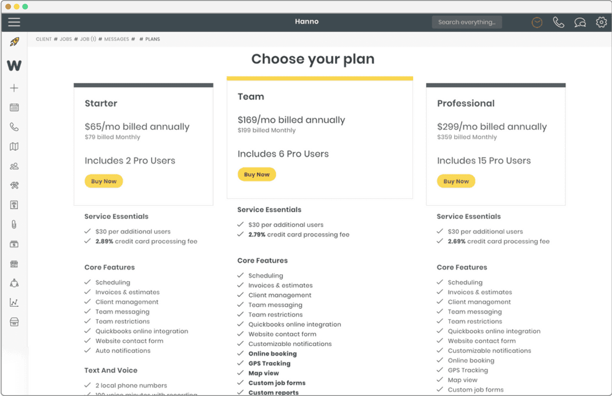
To better understand user pain points, I conducted comprehensive full-story observations, resulting in valuable insights. Additionally, I performed a heuristic evaluation to identify issues within the existing UX and UI design.

To better understand user pain points, I conducted comprehensive full-story observations, resulting in valuable insights. Additionally, I performed a heuristic evaluation to identify issues within the existing UX and UI design.

My evaluation revealed several challenges with the current design, including:

  • Cognitive noise cluttering the page.

  • A lack of clear hierarchy.

  • Unscannable text.

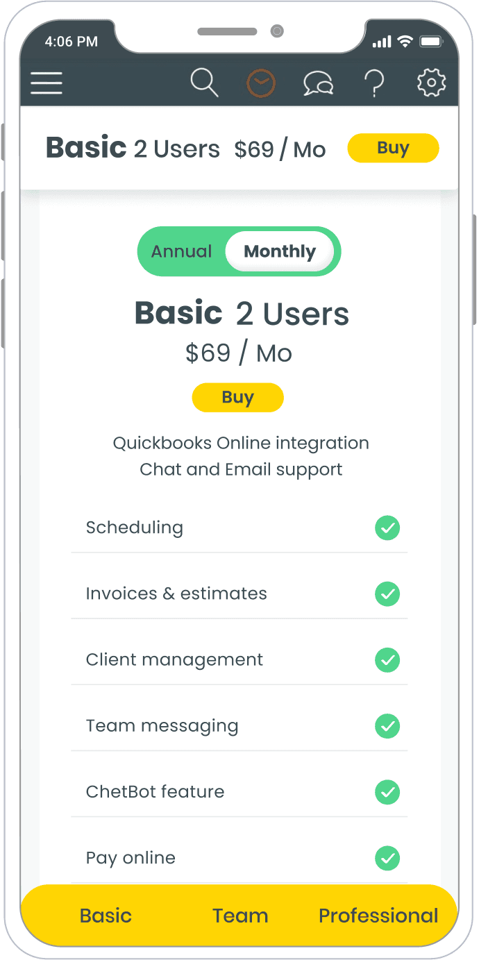
  • An unfriendly mobile version.

  • Confusing labels and terminology requiring multiple explanations.

To align the new content with an improved structure and layout, addressing the aforementioned issues, I ideated and sketched a redesigned layout.


Here is what I found:

  • There is a lot of cognitive noise

  • There is no clear hierarchy

  • Text isn’t scannable

  • The Mobile version is not user friendly

  • Labels, terms and terminology are clear enough,

It causes multiple explanations


To match the new content to the new structure and layout,that will serve best the functionality, and will solve the issues above, I ideate and sketch a new layout.


Sketch #1

Low Fidelity Wireframes

#1

Sketch #1

Low Fidelity Wireframes

#1

Sketch #1

Low Fidelity Wireframes

#1

Sketch #1

Low Fidelity Wireframes

#1

Sketch #1

Low Fidelity Wireframes

#2

Sketch #2

Low Fidelity Wireframes

#2

Sketch #2

Low Fidelity Wireframes

#2

Sketch #2

Low Fidelity Wireframes

#2

Sketch #3

Low Fidelity Wireframes

#3

Sketch #3

Low Fidelity Wireframes

#3

Sketch #3

Low Fidelity Wireframes

#3

Sketch #3

Low Fidelity Wireframes

#3

UI

Prototype

Key Fatures

Reduce Cognitive Noise

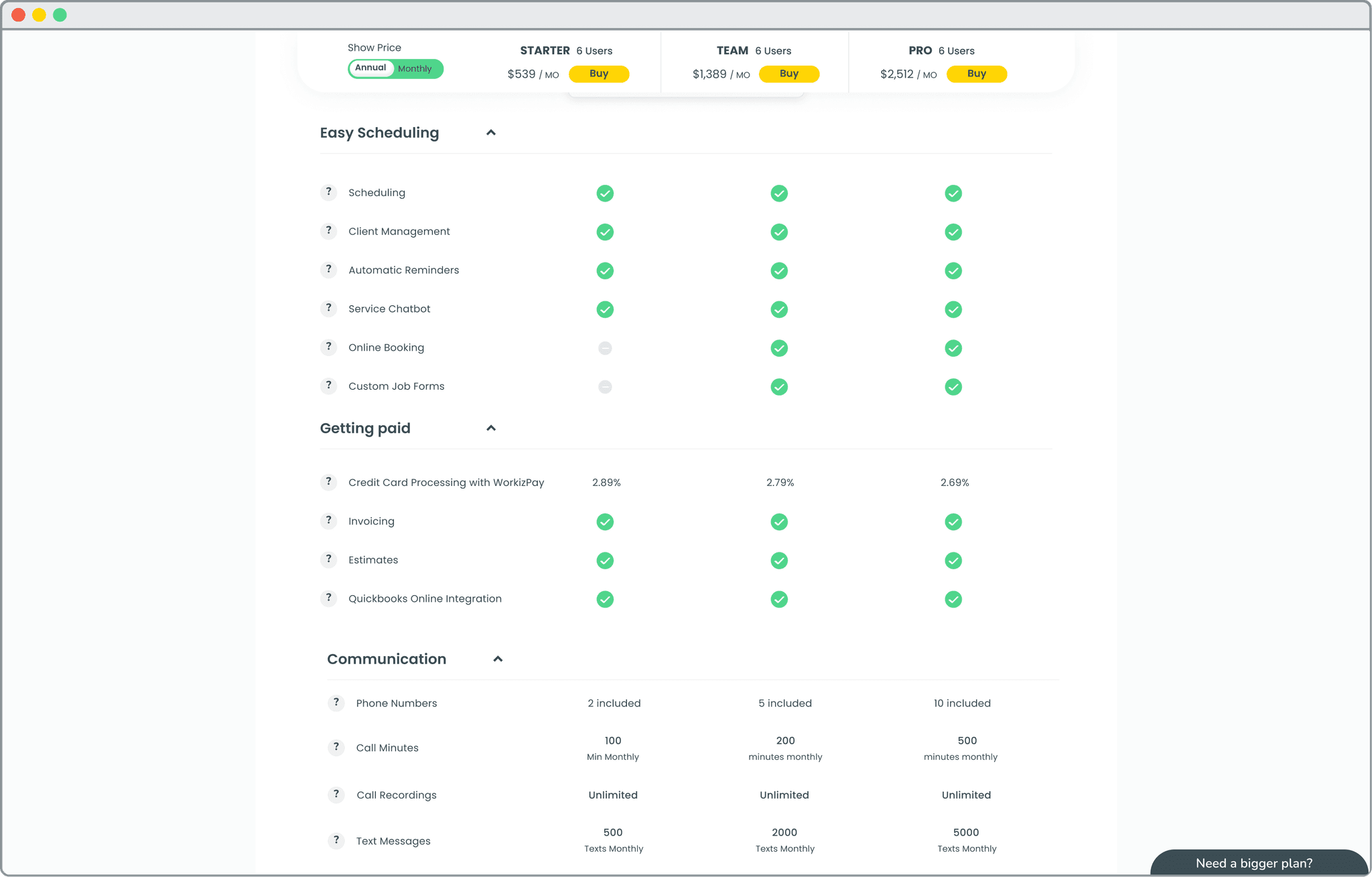
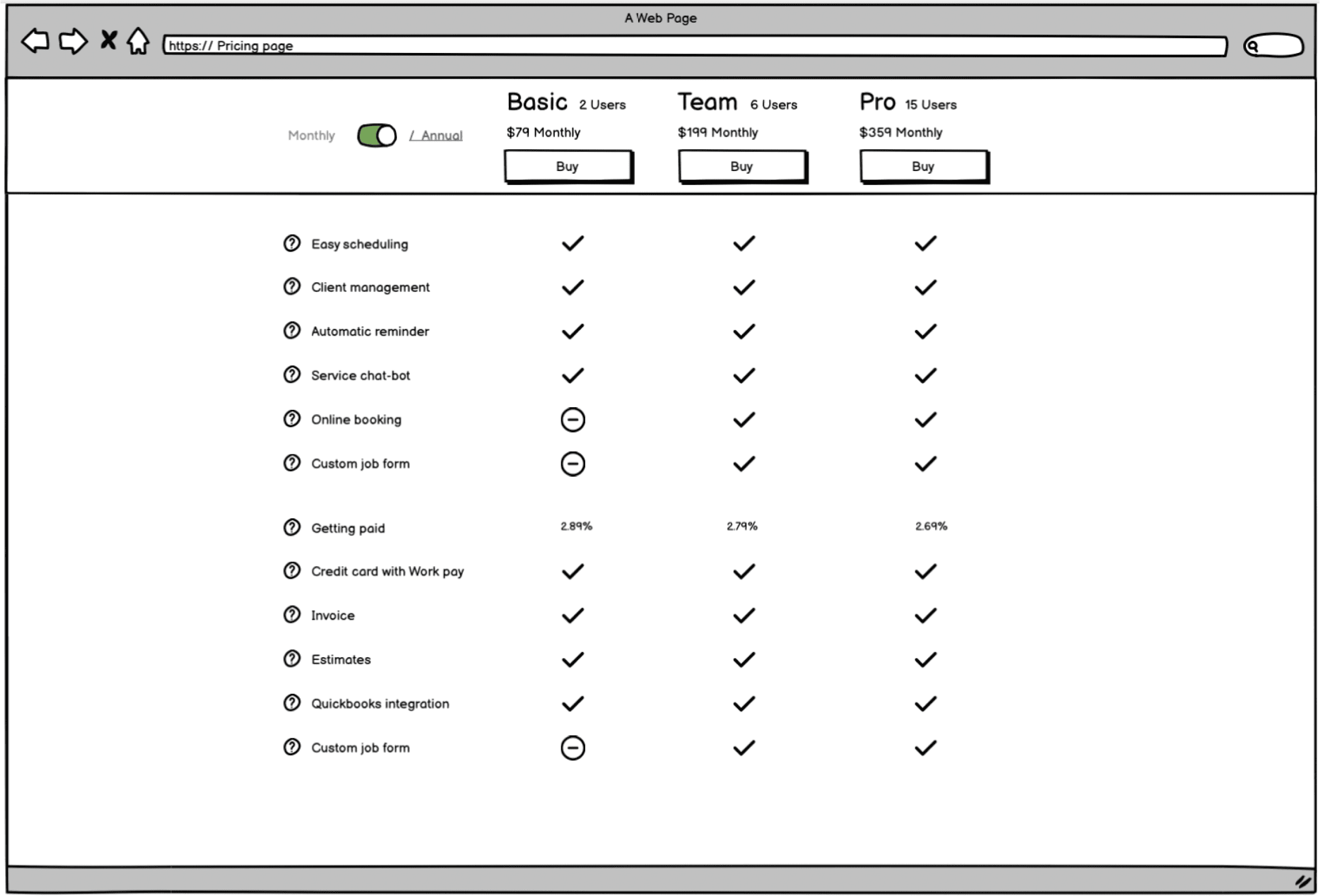
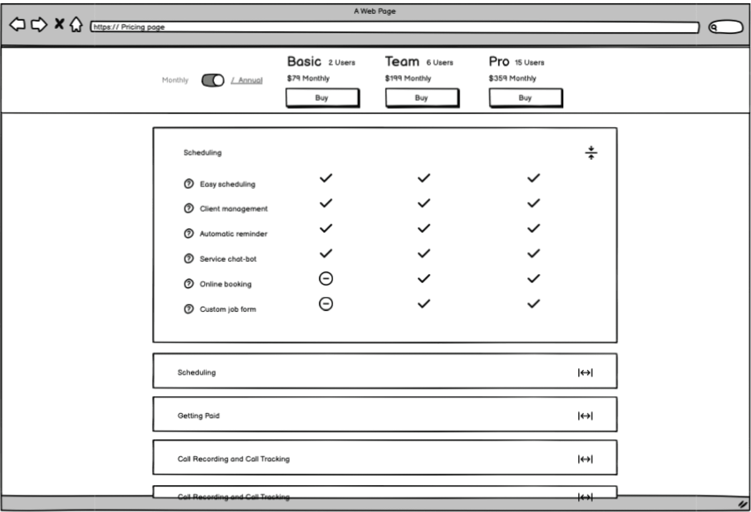
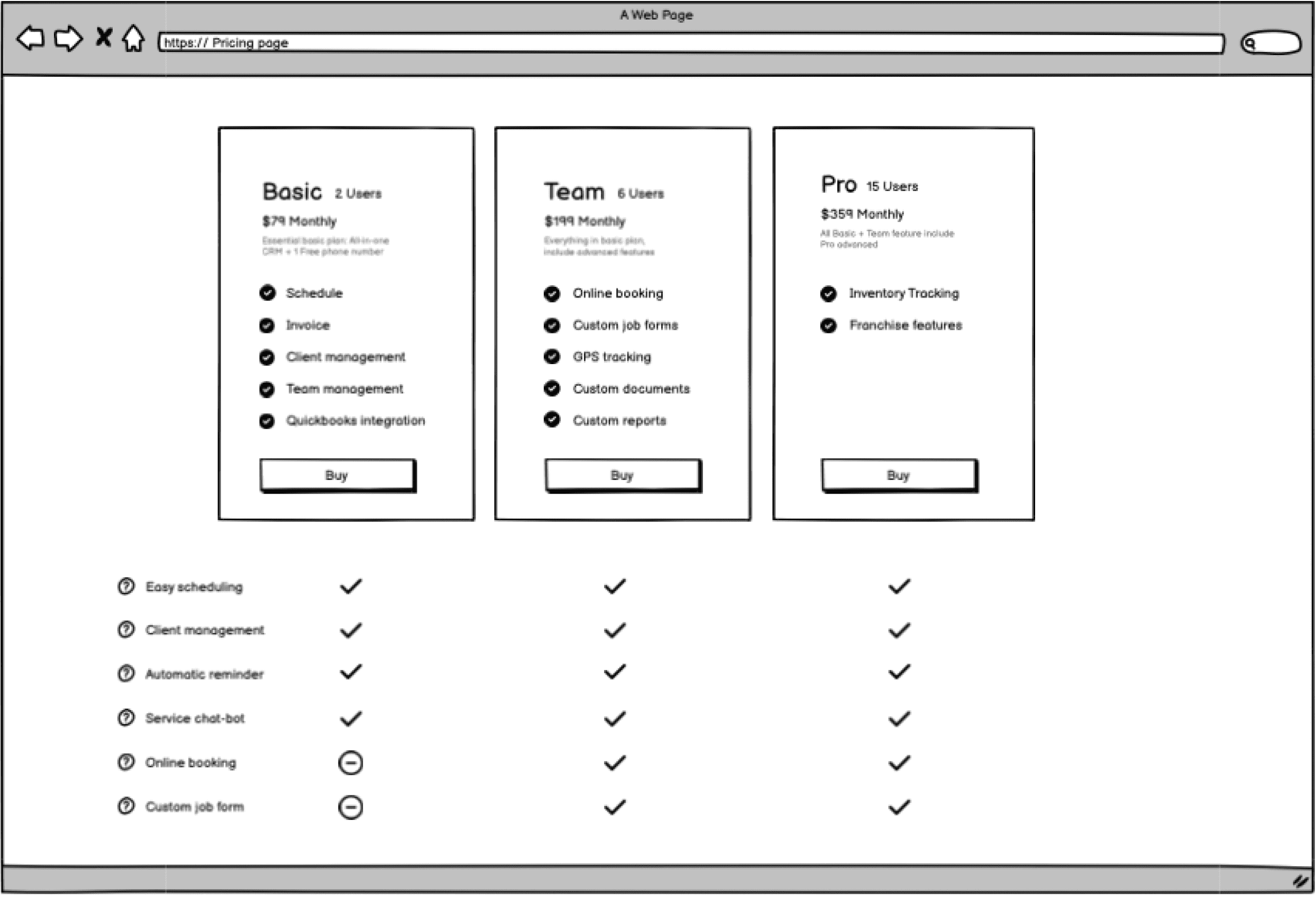
To make it look like a table, easy to compare I use this structure In the current state any feature has been written for three times

Improved Scannability

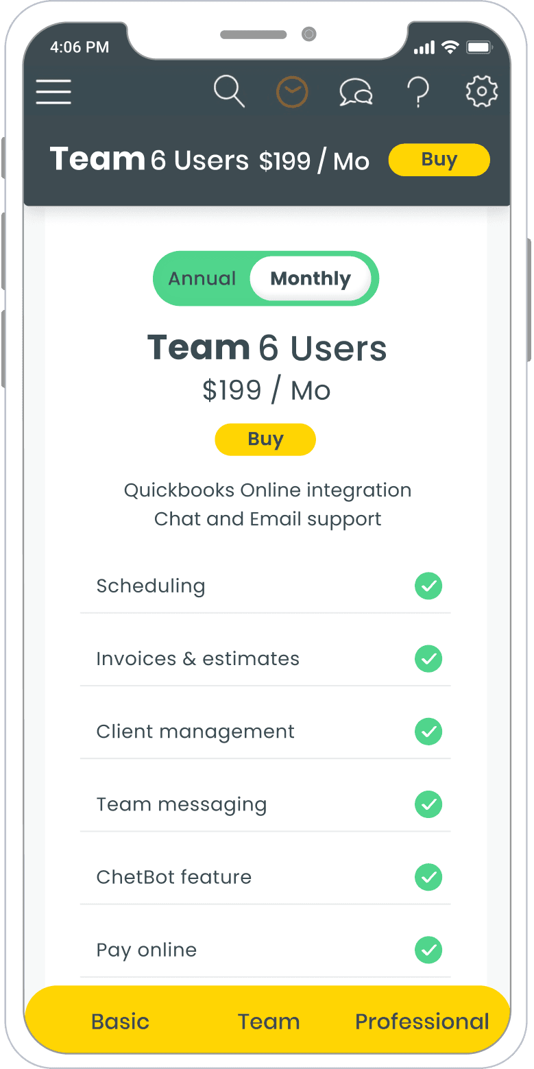
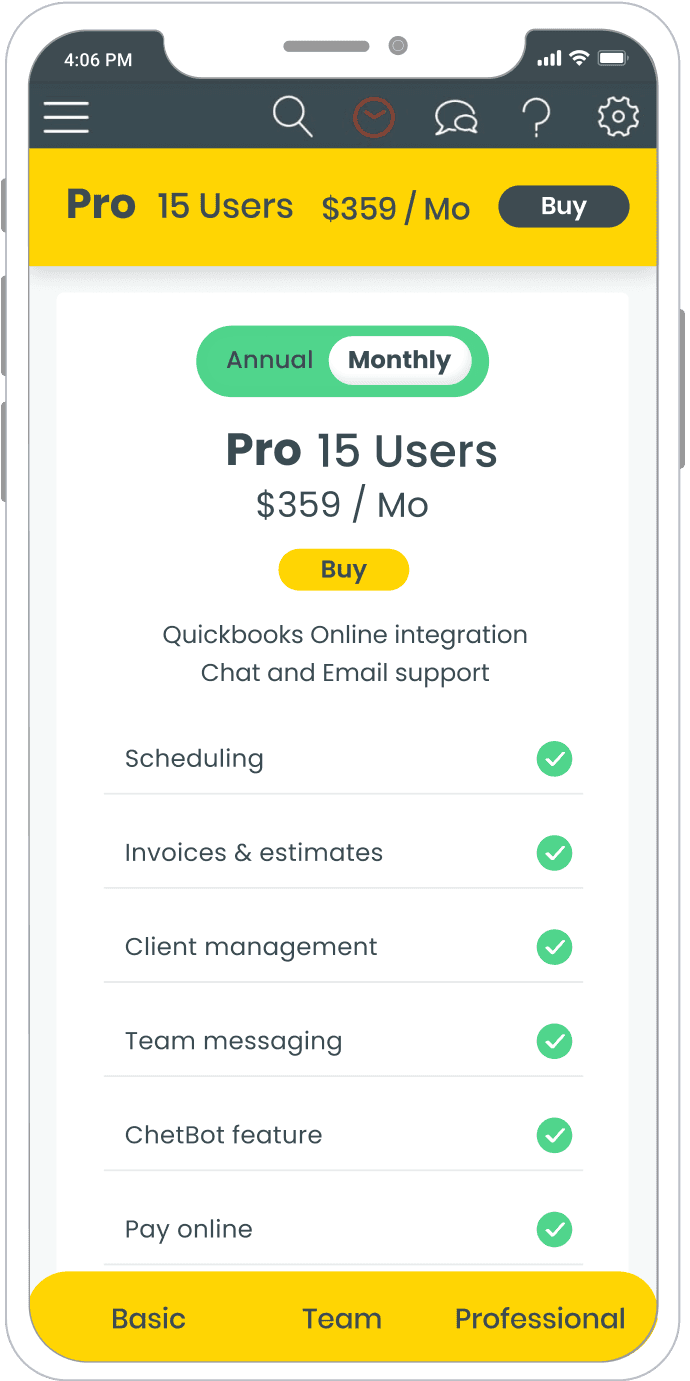
The revised design offered clearer hierarchy. Text became more scannable and user-friendly.

Add Interaction

To explain the feature, I use a question mark contain a hover state- To reduce the cognitive noise

Sticky Header Component

A sticky header component was introduced to assist users in comparing features across plans without excessive scrolling

Sticky Header Component

A sticky header component was introduced to assist users in comparing features across plans without excessive scrolling

Mobile

Results

Opportunity

The outcome of our efforts was highly satisfactory. Within two weeks, we introduced a new pricing page that delivered impressive results, with a 37% increase in engagement.

Challenges

One of the primary challenges we faced was the diversity of verticals served by Workiz. Each industry required different features or capabilities, making it necessary to accommodate various user needs. Despite this complexity, we strategically included a fundamental feature in a basic plan as a promotional marketing strategy.

Style

Font

Poppins

ABCDEFGHIJKLMNOPURSTUVWXYZ

0123456789

ABCDEFGHIJKLMNOPURSTUVWXYZ

0123456789

ABCDEFGHIJKLMNOPURST

UVWXYZ

0123456789

Colors

#FAD400

#3A5966

#F1F1F1

#50D58C

#FF6F64

Toggle

Icons

Radius

8px

8px

Shadow

Border
You May Also Like

You May Also Like

You May Also Like

You May Also Like

Let's Talk

You can find me here

© 2024 Made by Michal Hanno

Let's Talk

You can find me here

© 2024 Made by Michal Hanno

Let's Talk

You can find me here

© 2024 Made by Michal Hanno